You can build a portal with every feature on the wishlist. If the UX is bad, nobody will use it. Customers will call your support line, email spreadsheets, do anything to avoid logging into a portal that makes them think too hard.
Most portals fail not because they’re missing features, but because the features they have are painful to use. Adoption is a UX problem — and these are the design principles that solve it.
Information Architecture: Organize by Task, Not by Module
The most common mistake in portal design is organizing navigation around your internal structure. You have a “Documents” module, a “Billing” module, a “Support” module — so the nav reflects that.
Your customers don’t think in modules. They think in tasks: “I need to pay my invoice.” “I need to find that contract.” “I need to check the status of my request.”
Task-oriented navigation
Instead of:
- Documents
- Billing
- Support
- Reports
- Settings
Try:
- Pay an Invoice
- Find a Document
- Get Help
- Check Project Status
- Manage My Account
The navigation should answer “What can I do here?” not “What modules exist?”
Grouping and hierarchy
Group related actions together. If your portal serves multiple roles (admins, regular users, viewers), each role should see a navigation tailored to their tasks. An admin managing team permissions doesn’t need the same home screen as a customer checking an invoice.
Use role-based access not just for security, but for UX — hide what’s irrelevant.
First-Time Experience: Empty States Are Death
A user logs into your portal for the first time. They see a blank dashboard, empty lists, and zero context. They leave. They may not come back.
The first-time experience determines whether a user adopts the portal or ignores it.
Show value immediately
The first login should demonstrate value within 30 seconds. Options:
- Pre-populate with real data. If you have existing invoices, documents, or messages for this customer, show them immediately. Don’t make the portal feel empty when it doesn’t have to be.
- Welcome wizard. A short (3-5 step) guided tour that walks the user through key actions: “Here’s where you’ll find your invoices. Here’s how to message your account manager. Here’s your project status.”
- Progressive disclosure. Instead of overwhelming with every feature, reveal features as they become relevant. Show the messaging feature the first time a message is sent to the customer.
Design your empty states
When a section has no data yet, don’t show a blank page. Show:
- What will appear here once there’s data
- How to take the first action (“Upload your first document”)
- Why it matters (“Once your team is set up, you’ll manage permissions here”)
Every empty state is a mini onboarding opportunity.
Dashboard Design: Show What Matters Now
The dashboard is the most visited page in your portal. It sets the tone for the entire experience.
What belongs on the dashboard
- Pending actions — Invoices to pay, documents to sign, requests awaiting response. These are the reason most users logged in.
- Recent activity — What changed since the last visit? New messages, status updates, uploaded documents.
- Active items — Open projects, in-progress tickets, upcoming deadlines.
- Quick actions — 1-click access to the most common tasks (submit a request, send a message, download a statement).
What doesn’t belong on the dashboard
- Feature marketing — “Did you know you can use our new analytics tool?” Save this for contextual prompts.
- Everything — A dashboard showing every feature is a dashboard showing nothing. Prioritize ruthlessly.
- Static content — If it doesn’t change between visits, it doesn’t belong on the dashboard.
Personalization
The best dashboards adapt. A customer who primarily uses the portal for billing sees invoices front and center. A customer who mostly checks project status sees their project timeline first. Start simple — let users customize widget layout — and build toward behavioral personalization over time.
Search: The Most Underinvested Feature
When a portal has more than a handful of pages or documents, search becomes the most important navigation tool. It’s also the most neglected.
Why search matters
Users search in their own language, not yours. They type “receipt” when the portal calls it “invoice.” They search for “John’s email” when they mean “client contact record.” If your search only matches exact field names, it fails constantly.
Search that works
- Fuzzy matching — Handle typos and close matches.
- Synonyms — Map common terms to your internal terminology.
- Global scope — Search across documents, messages, invoices, help articles — everything. A search bar that only searches one section is worse than no search at all.
- Filters and facets — Let users narrow results by type (document, invoice, message), date, or status.
- Recent and suggested — Show recent searches and popular queries when the search bar is focused.
If your portal includes a knowledge base, search quality directly impacts whether customers find answers or submit support tickets instead.
Mobile-First Design
Over 50% of portal logins happen on mobile devices. If your portal was designed for desktop and squeezed onto a phone screen, the experience is broken.
Mobile-first means
- Design for the smallest screen first, then add complexity for larger screens. Not the other way around.
- Touch targets — Buttons and links need to be at least 44x44 pixels. Tiny links crammed together are unusable on touch screens.
- Simplified navigation — Hamburger menus are fine on mobile, but limit menu depth. Two taps to any key action, maximum.
- Responsive tables — Data tables are the most common mobile UX failure. Use card layouts on mobile instead of horizontal-scroll tables.
- Offline awareness — If the connection drops, show clear status. Don’t silently fail.
What to prioritize on mobile
Not every portal feature needs full mobile parity. Focus on the actions customers most commonly do on their phone:
- Check status
- View and approve items
- Read and respond to messages
- Pay invoices
- View documents
Save complex tasks (detailed reporting, bulk operations, admin configuration) for desktop.
Accessibility: Not Optional
Accessibility is a legal requirement in many jurisdictions and a moral imperative everywhere. It’s also good UX — accessible design benefits all users, not just those with disabilities.
WCAG essentials for portals
- Color contrast — Text must have a 4.5:1 contrast ratio against its background (WCAG AA). Don’t convey meaning with color alone — add icons or labels.
- Keyboard navigation — Every action must be reachable without a mouse. Tab order should be logical. Focus indicators should be visible.
- Screen reader support — Use semantic HTML (
<nav>,<main>,<button>,<table>). Add ARIA labels where HTML semantics aren’t sufficient. Test with a screen reader. - Form labels — Every input needs a visible, associated label. Placeholder text is not a label.
- Error messages — Clearly identify what went wrong and how to fix it. Don’t just turn a field border red.
Testing accessibility
Use automated tools (axe DevTools, Lighthouse) as a baseline, but don’t rely on them exclusively. Automated tools catch about 30% of accessibility issues. Manual testing with keyboard navigation and screen readers catches the rest.
Reduce Clicks: Every Click Is Friction
Every additional click between a user and their goal increases the chance they give up. Audit your portal for common tasks and count the clicks.
The click audit
Map out the top 5 actions your users perform. Count the clicks from login to completion.
- Pay an invoice: Login > Dashboard > Billing > Invoices > Select invoice > Click pay > Confirm = 7 clicks. Too many. Put “Pay Invoice” on the dashboard with the amount shown = 2 clicks.
- Download a document: Login > Documents > Browse folders > Find file > Click download = 5 clicks. Add recent documents to the dashboard or improve search = 2-3 clicks.
- Check project status: Login > Projects > Select project > View status = 4 clicks. Show active project status on the dashboard = 1 click.
Reduce-click strategies
- Smart defaults — Pre-select the most likely option. If a customer has one active project, don’t make them select it from a list.
- Inline actions — Allow editing, approving, or downloading directly from list views instead of requiring navigation to a detail page.
- Batch actions — Let users select multiple items and act on them at once (download all, approve all).
- Persistent context — Remember the user’s last-used filters, sort orders, and selections.
Consistent Patterns
Once a user learns how one section of the portal works, every other section should feel familiar.
What consistency means in practice
- Lists behave the same everywhere — If invoices have search, sort, and filter, so do documents and support tickets.
- Actions are in the same place — Primary actions always in the top-right corner (or wherever you place them — just be consistent). Destructive actions always require confirmation.
- Status indicators use the same visual language — Green for active/complete, yellow for pending, red for overdue. Same colors, same shapes, same position — everywhere.
- Forms follow the same layout — Labels always above fields (or always beside them). Required fields always marked the same way. Error messages always appear in the same position.
- Navigation patterns are predictable — If clicking a row opens a detail panel in one section, it should do the same in other sections. Don’t open a detail panel for invoices but navigate to a new page for documents.
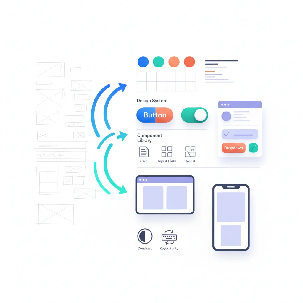
Design system
If your portal is complex enough, build a simple design system: document your components, patterns, colors, and spacing. Even a lightweight style guide prevents inconsistency as more people contribute to the portal.
Good vs. Bad Portal UX: Real Patterns
Bad: The feature dump
A portal that exposes every feature in a flat navigation with 15+ menu items. Users are overwhelmed and can’t find anything. No one uses 80% of the features because no one knows they exist.
Fix: Group features into 4-5 top-level categories. Use progressive disclosure to reveal advanced features in context.
Bad: The PDF graveyard
A document portal that’s just a folder hierarchy of uploaded PDFs. No search, no preview, no metadata. Users download every PDF to find the one they need.
Fix: Add full-text search, document previews, tags, and filters. See document management for what good looks like.
Bad: The desktop-only afterthought
A portal with complex data tables, tiny buttons, and hover-dependent interactions. Works fine on a 27-inch monitor. Unusable on a phone.
Fix: Design for mobile first. Use responsive layouts, touch-friendly targets, and card-based views on small screens.
Good: The task-oriented dashboard
A dashboard showing 3-4 pending items that need attention, with one-click actions. Recent activity feed below. Search bar at the top. Zero noise.
Good: The self-service loop
A customer searches the knowledge base, finds an answer, and never submits a ticket. When they can’t find an answer, the search results page offers a “Still need help? Submit a request” button with the search query pre-filled.
Where to Start
If your portal already exists and the UX needs work, don’t redesign everything at once. Prioritize:
- Fix the dashboard — This is what users see every login. Make it useful.
- Add/improve search — High impact, relatively contained scope.
- Audit the top 5 tasks — Count clicks, reduce friction.
- Fix mobile — Test every critical flow on a phone.
- Run an accessibility audit — Fix the critical issues first.
If you’re building a new self-service portal, bake these principles in from day one. Retrofitting good UX is always harder than designing it up front.
Adoption isn’t about adding features. It’s about making the features you have effortless to use. For more on driving adoption once your UX is solid, see our guide on portal adoption strategies.